Section 1 - Designing a Spreadsheet
For a user to be able to interpret information from a spreadsheet it must have the following characteristics; clear layout, columns/rows labelled, important headings highlighted, clear fonts, hiding information not required, clear entries and be understandable. For example, if a company wanted to use a spreadsheet to record its financial details, it would need clear title headings for columns and rows, be formatted clearly, have important headings such as profit or loss highlighted with a easy to read font.
Design Guidelines
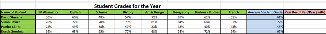
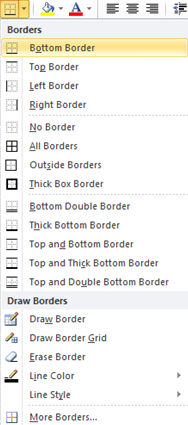
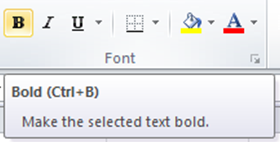
As described above, there are basic guidelines to spreadsheet design to enable the user to clearly understand the information displayed to them. Here we will look at a class of students and their overall mark percentages. It's important that the tutor and other staff can interpret the information on the spreadsheet and this is why it needs to be clearly presented. The tutor must make sure that percentage marks are clearly assigned to a subject and this can be achieved by using the available columns, rows, clear text, fill and boarders options. Below we can see these options;
Once these bold, fill and border options have been used in the correct places around the spreadsheet, a clear and easy to understand spreadsheet is created such as the one shown below. The grade percentages are clearly set under a subject title, consequently the titles are black and bold to allow easy reading. All text and percentage figures have a smart black border for easy identification of information and main headings have a green colour highlighted background. The spreadsheet also has a large clear bold title to inform the user of the purpose.